The brief
Floflotographie is a sports photography portfolio. The site groups images by discipline: athletics, motorsport, ice hockey and lifestyle. Visitors can browse the galleries, read an about page, look through recent projects and follow the photographer's Instagram account. The whole site is available in French and English.
The starting point was simple: let the photographs take up space without sacrificing speed on mobile. A photo portfolio collects heavy files quickly, and a gallery that has not been prepared properly turns a strong image into a slow page. We treated performance as a design constraint from the first screen, not as a setting to adjust at the end.
An editorial layout
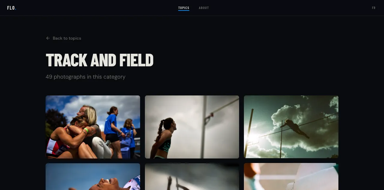
The home page places a large title behind a photograph. The contrast between text and image changes with each photo, but the structure stays readable. Discipline pages alternate text blocks and image grids. Each category shows its photo count, for example 49 images for athletics, so visitors know the size of the series before opening it.
Transitions are short, dark mode follows the system preference, and navigation stays the same from one page to the next. The site does not try to behave like an application. It keeps a portfolio logic: a clear entry point, recognisable series and images that matter more than the interface. The projects page reuses the same image script for its covers.
The path stays short: a home page, four topics, an about page and a projects page. The breadcrumb, the photo count and the return link give orientation without adding menus. On mobile the grid tightens, the headings keep their hierarchy, and images load at the size of the screen.
The work happens before the browser
The image script is the centre of the project. It reads the source JPG files and generates four widths in AVIF and WebP, plus a JPG fallback. It also writes typed manifests per topic and a placeholder visual into each image's metadata.
That has two consequences. First, pages load only the images they display, with known dimensions, which prevents layout shifts while images arrive. Second, the script only reprocesses changed files and removes derivatives that no longer match a source. The build stays predictable as the portfolio grows.
Each page has its own metadata, Schema.org structured data and an Open Graph image generated on the fly. Search engines and social previews receive a suitable image without manual work. The English version keeps the same page structure with its own copy and metadata.
The stack
The site runs on TanStack Start, React 19, TypeScript, Tailwind CSS v4 and Paraglide JS for both languages. Server rendering goes through Nitro on a Node server. Public routes are prerendered, and images follow the Sharp pipeline described above.
The code stays close to the content. Galleries read the manifests, discipline pages share one structure, and the image components expose the available sizes. There is no database to maintain when a new series is published.
Gallery pages use the same image component as the home page. A photo can appear in a topic and on the projects page without a second derivative. The manifests keep the paths and dimensions in one place, so a change to the image script does not require editing each page.
The English version does not duplicate the image work. Both languages read the same manifests and the same derivatives. Only the copy, metadata and page URLs change.
The image script runs before the build, not on browser request. A visitor never triggers an image conversion, and the server only serves files that are already prepared.
The result
Adding photos means dropping files into a folder. The build handles formats, sizes and manifests, then the galleries update. The portfolio stays light on mobile while showing images at full size on a wide screen.
The site is live at floflotographie.be.